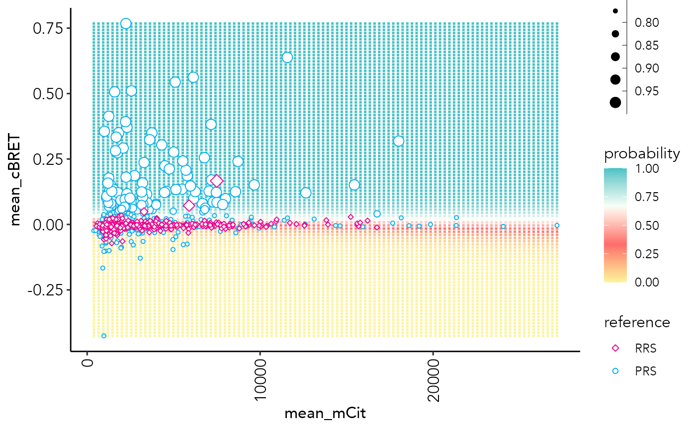
Plot a probability grid from the mean probabilities from the 'ensembleSize' number of models
probGrid.plot.RdPlot a probability grid from the mean probabilities from the 'ensembleSize' number of models
probGrid.plot(
  ppi_prediction_result,
  n = 100,
  x.log.scale = TRUE,
  xlim = c(NA, NA),
  ylim = NULL,
  set = "train",
  model = "all",
  training_set = "all",
  x.nudge = 1,
  type = "2D",
  assay = ppi_prediction_result$assay
)
Arguments
- ppi_prediction_result:
result object from the ppi.prediction() function.
- n:
grid size. For 3 assays, will be limited to grid size of 40 to reduce computing time.
- x.log.scale:
logical to log-scale x-axis values
- xlim:
Numeric vector of two values specifying the left and right limit of the scale
- ylim:
Numeric vector of two values specifying the bottom and top limit of the scale
- set:
Character. PPI set to generate the plot for: "test" or "train"
- model:
Integer (1L) or "all". Plots the decision boundaries for a specific model (e.g. 1L for model 1) or the mean of all models.
- x.nudge:
Numerical. Which value to add to log transformation of x-axis values, in case of negative x values.
- type:
Character. Specify to plot as "2D" or "3D" plot for trainings with 3 features.
- assay:
Character. Specifies which assays to plot against each other. Must be one of the training features.
Value
a ggplot2 object
Examples
data("example_ppi_prediction")
probGrid.plot(example_ppi_prediction)
#> Warning: Removed 91 rows containing missing values (geom_point).