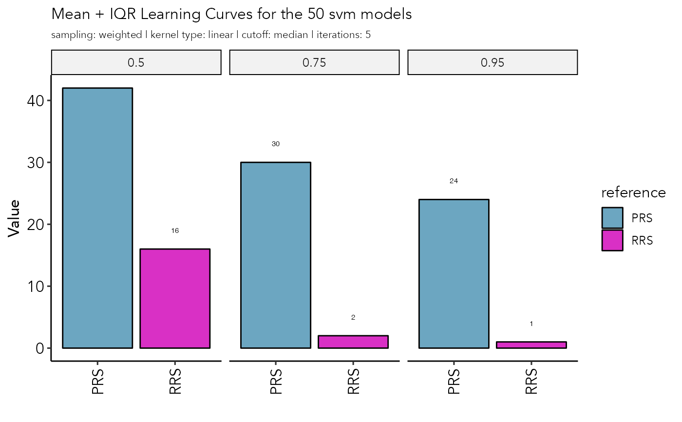
Plot a bar diagram of the recovery rates at 50%, 75% and 95% probability
recovery.plot.RdPlot a bar diagram of the recovery rates at 50%, 75% and 95% probability
recovery.plot(
  ppi_prediction_result,
  set = "train",
  y = "count",
  groupby = "reference"
)
Arguments
- ppi_prediction_result:
result object from the ppi.prediction() function.
- set:
PPI set to generate the plot for: "test" or "train"
- y:
specify to plot number ('count') or fraction ('frac') of positive interactions
- groupby:
for the training set group by reference or complex
Value
a ggplot2 object
Examples
data("example_ppi_prediction")
recovery.plot(example_ppi_prediction)